Button BackToTop
Renders a button component that scrolls the page to the top when clicked. This is a React component written in Typescript, styled with Tailwind CSS that can be copy & pasted into your codebase.
Preview
This is how the code looks like in action.
Step-By-Step Guide
1. Install Dependencies
Icons by Lucide. But you can use any or none
cli
1npm install lucide-reactButton component by shadcn/ui
cli
1npx shadcn-ui@latest add buttonCopy the function 'cn'. Link -> cn Function
2. Copy the Source Code
@/component/button-back-to-top.tsx
1'use client';
2
3import { Button, ButtonProps } from '@/ui/Button';
4import { cn } from '@/lib/utils';
5import { ArrowUp } from 'lucide-react';
6
7/**
8 * Renders a button component that scrolls the page to the top when clicked.
9 *
10 * @param buttonText - The text to display on the button. Default is 'Back to top'.
11 * @param showArrowIcon - Determines whether to show an arrow icon next to the button text. Default is true.
12 * @param className - Additional CSS class names to apply to the button.
13 * @param variant - The variant of the button. Default is 'secondary'.
14 */
15export default function Button_BackToTop({
16	buttonText = 'Back to top',
17	showArrowIcon = true,
18	className,
19	variant,
20}: {
21	buttonText?: string;
22	showArrowIcon?: boolean;
23	className?: string;
24	variant?: ButtonProps['variant'];
25}) {
26	return (
27		<Button
28			className={cn('fixed bottom-4 right-4 z-50', className)}
29			onClick={() => {
30				window.scrollTo({ top: 0, behavior: 'smooth' });
31			}}
32			variant={variant || 'secondary'}
33		>
34			{buttonText}
35			{showArrowIcon && <ArrowUp size={18} className="pl-1" />}
36		</Button>
37	);
38}3. Use in your App
page.tsx
1import {Button_BackToTop} from '@/components/button-back-to-top'
2
3export default function Page(){
4  return(
5    <Button_BackToTop />
6  )
7}Tech Stack
Only the finest ingredients are used in our products. We made sure that we only use the best technologies available which offer a free tier! Yes, you read that right. Everything can be set up for FREE!
Example Usage
See this component live in action. Are you using the component on your website? Shoot us an email (support@boilerplatehq.com) and we will link to you.
BoilerplateHQ
Have a look in the bottom right corner of this page!

Your Website?
Are you using this component? Shoot us an email and we will link to you.
You May Also Like
Didn't find what you were looking for? Check out these other items.
Ui Component Library
Want to create your own Ui Component Library like shadcn/ui? This is your template!
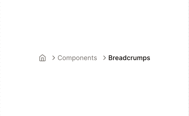
Breadcrumps
Renders a breadcrumb component that displays the current page's path.
Component Multiplier
Renders multiple instances of a given component, e.g. for testing purposes.
Frequently Asked Questions
We have compiled a list of frequently asked questions. If you have any other questions, please do not hesitate to contact us via email or using the chat function. We are here to help!